
Don’t throw out that stamp — it might be a New Brunswick woman’s original design

Jocelyne Saulnier said it was one of the most exciting days of her career when Canada Post called her a few years back to see if she’d be interested in designing some postal stamps.
The Riverview, N.B., woman said they were gauging her interest and told her that she would get a call when a subject came up that would suit her design style.
Now, her designs will be part of the holiday stamp series for this year.
“It’s quite a pinch-me moment,” she said.
Saulnier has had an extensive career in graphic design, which began when she completed a bachelor of design degree at the Nova Scotia College of Art Design. She worked at some agencies in Halifax and then Moncton before starting to work on her own around 15 years ago.
Her Canada Post design is a panoramic wintry scene from left to right made up of three individual stamps each depicting a region of Canada — West, Central and East.
The West Coast design shows snow-covered mountains and bright blue water, with people skiing and snowboarding down a mountain.
The Central design has tall trees surrounding an outdoor skating rink filled with people and a glowing fire off to the side.
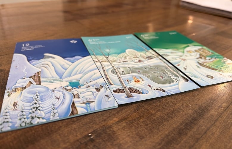
The East Coast design is a lighthouse scene with people sledding down a snowy hill as choppy green waves lap against the cliffside.
Each design is quite different in appearance, said Saulnier, because she didn’t want the consumer to confuse them. Each has a different shade of blue or green for the sky, making them especially unique from one another.
The paintings on the stamps were done by Tim Zeltner, an illustrator based outside of Toronto.
Saulnier said she chose Zeltner for the project because of the magical and whimsical style of his art.
She said she got a description of the concept from Canada Post and then gave Zeltner her rough sketch showing what she envisioned for the series along with samples of his work that represented what she had in mind.

Zeltner would come back with a rough sketch, the two would tweak it and Zeltner would come back with an even more detailed pencil sketch. Once the pair were happy with the design, Zeltner would proceed with a paintbrush.
Saulnier said she thinks the stamp series will appeal to a broad range of Canadians.
She said looking at the final printed product, it is almost exactly like what was on her screen, but a type of varnish was added to certain areas, which Saulnier said makes the snow look almost pearlescent.
Saulnier has already placed an order for the stamp series, adding an extra level of excitement to sending her Christmas cards this year.

;Resize=(620))
;Resize=(620))
;Resize=(620))